How to Match Umbrella Colors to Your Raincoat
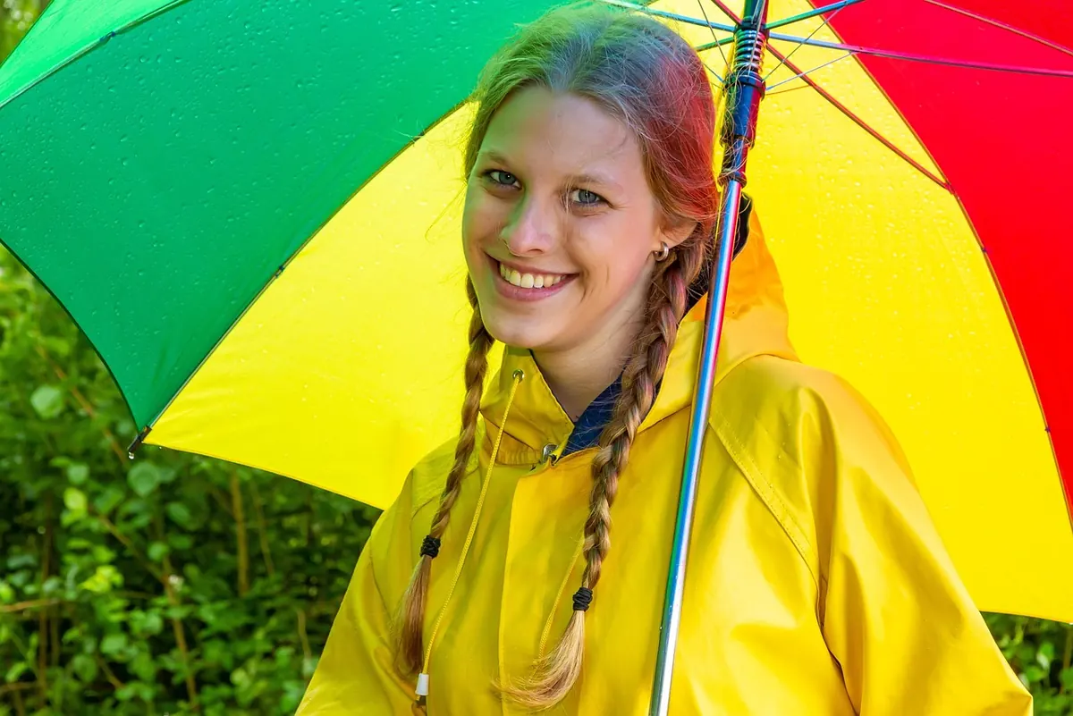
A rainy morning narrows the wardrobe fast. The coat goes on, the boots go on, and the umbrella comes off the stand by the door. That umbrella is the largest block of color you will carry all day, and it sits within arm's reach of your face and your coat for hours. Thirty seconds of thought about how those pieces relate to each other is the difference between looking put together and looking like you grabbed whatever was closest.
The coat sets the rules. Before you buy anything new, answer two questions about the raincoat you actually wear: is its color warm or cool, and is it light or dark? A rust trench is warm and mid-tone. A charcoal mac is cool and dark. Olive sits warm and muted. Pale stone is light and neutral.
Once you know that, the umbrella has a job to do. If the coat is already loud — a bright yellow slicker, a red trench, a bold checkerboard print — keep the umbrella quiet. Charcoal, navy, cream, and deep black all let a statement coat speak. If the coat is understated, the umbrella can carry the color. A dove-grey raincoat with a forest green umbrella looks considered. The same grey coat with a grey umbrella looks like you stopped thinking at the doorway, which is perfectly fine on a Tuesday morning and slightly flat at a wedding.
Stay inside one color family and separate the shades by lightness. Navy coat, slate blue umbrella. Olive coat, sage umbrella. Burgundy coat, deep wine umbrella. This reads as one continuous outfit with depth to it. The trap is picking two mid-tones so close together that they look like a failed match — a soft navy coat with a slightly different soft blue canopy just looks like a laundry accident. Push the umbrella noticeably lighter or darker than the coat.
Treat black, charcoal, cream, tan, and navy as honest neutrals — navy behaves like a neutral here even though it is technically a color. Pair any of them with a colored coat and the outfit resolves itself. A note on black: a black umbrella beside a pale cream or blush coat can look heavy, like a punctuation mark in the wrong place. Charcoal or deep grey softens that contrast without losing the structure. Cream and ivory umbrellas, meanwhile, brighten the area near your face on days when the sky is doing the opposite.
Colors from opposite sides of the wheel can work beautifully, but only when they are pitched at the same intensity. Mustard with deep teal. Burgundy with forest green. Coral with navy. Cobalt with camel. The pairing that fails is usually a mismatch of loudness rather than hue: a pastel mint umbrella with a saturated emerald coat looks like a mistake because one color is shouting and the other is whispering.
If two colors keep fighting, change the intensity before you change the color.
When the raincoat has a pattern, the umbrella should quote it, not compete with it. Look at the smallest color in the plaid or print — that is usually the easiest one to echo without looking like you bought the set from a catalog page. A grey-and-pink plaid coat wants a dusty rose umbrella, not a hot pink one. Scale matters too: busy coat, solid umbrella. If you love a printed umbrella, choose a small-scale pattern that shares at least two colors with the coat and keep the coat solid that day.
Most outfits look best with about three colors in play, and the umbrella and boots both count. The reliable trick is repetition: let one color appear twice and everything else stay calm. Red boots with a red umbrella and a grey coat and grey bag gives you two colors doing the heavy lifting and one accent. Swap in navy coat, tan boots, tan-strapped bag, and a mustard umbrella, and the mustard works precisely because it appears only once. Four unrelated strong colors will read as unintentional even when every individual piece is lovely.
Small details count more than people expect. A gold-tipped umbrella with gold buckles on your boots looks like a decision. A wooden handle that echoes a leather bag strap does the same job quietly. If you carry the umbrella closed for most of the day, the handle and tip are what people actually see, so pick those with as much care as the canopy.
Rain changes color. Wet fabric reads darker than dry fabric, and overcast light strips out the warm tones that made your coat look rich in the shop. Glossy nylon, clear PVC, and matte cotton each behave differently: shine reads brighter and dressier, matte reads softer and more casual. Two saturated colors where one is glossy and the other matte tend to look mismatched, so aim for a consistent finish. Overcast light also compresses contrast, so if you want a light-dark pairing to land, push it a step further than you would indoors. Check the combination near a window in daylight before you commit to a new umbrella.
None of this requires a matching set or a new wardrobe. It requires one deliberate choice, made at the door, about how the biggest color you carry relates to the coat underneath it. Make that choice and the weather stops being an excuse for a forgettable outfit.
Photo: Photojog / Pixabay
Previous Post
Seattle Rain: Choosing an Umbrella for Pacific Northwest Drizzle
Next Post
Travel Umbrella Buying Guide: What Fits in a Carry-On and Survives Wind